How Do Printers Make Red? A Step-by-Step Color Printing Guide
Explore how printers reproduce red using CMYK inks, color management, and calibration. Learn magenta–yellow mixing, ICC profiles, paper choices, and troubleshooting for vivid red results.

How do printers make red? In most common printers, red is produced primarily by combining magenta and yellow inks within the CMYK color space. The exact shade is then tuned by the printer driver, ICC profiles, and halftone dithering. Color management and paper choice influence how vivid or muted the final red appears.
The Science Behind Red in Printing
Color science is central to how printers reproduce red. Light reflected from a page is a mix of wavelengths, and our eyes interpret that mix as color. In most consumer and office printers, red is seen not as a pure red spectrum, but as a composite produced by magenta and yellow inks laid down in tiny dots. The key question is not simply “can a printer make red?” but “how do printers make red accurately across devices and lighting conditions?” So, how do printers make red? The answer lies in subtractive color theory, ink properties, and digital-to-physical translation. The printer receives digital values (RGB or a color-managed CMYK workflow) and converts them into a dot map for each ink channel. The final red is a product of ink opacity, halftone patterns, ink layering, and the paper’s whiteness. Color management takes center stage, aligning your screen intent with what lands on paper under defined viewing conditions. Print Setup Pro emphasizes that calibration, consistent paper, and properly installed ICC profiles are essential to predictable red output.
The CMYK Color Model and Red
Most printers operate in CMYK: cyan, magenta, yellow, and black. Red is not a pure spectral color in this system; instead, it emerges from magenta and yellow forming a warm red hue on white paper. Cyan suppresses red shades, while black can deepen the tone or adjust shadows. The resulting red depends on how densely the magenta and yellow inks are laid down (dot gain, print resolution, and halftone technique all matter). When the digital design calls for red, the RIP ( Raster Image Processor ) and printer driver map those values to appropriate CMYK separations. This mapping must account for ink transparency and the substrate, so the same RGB red may print differently on different papers or printers.
Magenta and Yellow: The Red Formula
The classic path to red in CMYK starts with magenta and yellow inks. The exact ratio defines the lightness and warmth of the red. A higher magenta base yields a cooler, purplish red, while more yellow leans toward orange-red tones. The printer’s rendering intent (perceptual, relative color, saturation) and the media’s whiteness influence how aggressively those inks are applied. In practice, designers should prefer using color-managed workflows where reds are defined in CMYK values that map consistently to the target printer and paper. For photo printing, soft proofing with ICC profiles helps anticipate how reds will appear in print.
Does Black Help Red?
Black (K) is sometimes used to deepen or neutralize red tones, especially in darker or print-dominated scenes. In CMYK, black is not merely a shadow; it interacts with magenta and yellow to affect perceived saturation and balance. Deep reds may require a small amount of black to preserve detail in shaded areas, but relying too heavily on black can muddy the hue. Color management tools will decide when to add K for tone control while preserving the intended red’s brightness and chroma. Practically, expect different results on gloss vs matte papers, where ink spread and light reflection alter how red reads.
Red Across Printer Technologies: Inkjet vs Laser
Inkjet printers deposit liquid inks that diffuse slightly on paper, creating smooth gradations that can render reds with subtle warmth or coolness depending on ink formulation and media. Laser printers use dry toner fused with heat, offering crisp edges and consistent color blocks, but reds can appear flatter if toner densities aren’t well balanced. In both cases, the red you see on screen requires careful color management and appropriate CMYK values to translate the digital red into the physical inks that your device uses. Print setups must account for device differences; otherwise, your reds will drift with every device change.
Color Management: ICC Profiles and Rendering Intent
ICC profiles encode how devices reproduce color and provide a bridge between the digital workspace and the print device. Rendering intents (perceptual, relative color, saturation) govern how out-of-gamut reds are handled when mapping to CMYK. Calibrating monitors and printers ensures a closer match between what you see on screen and what prints. This section emphasizes using device-specific profiles and soft proofing to anticipate changes in red hue. Print Setup Pro stresses the importance of attaching the correct profile to each project and avoiding ad-hoc color adjustments in Photoshop or other editors that bypass device reconciliation.
Paper and Lighting: How They Affect Red Perception
Paper choice has a dramatic effect on red. Glossy papers tend to make reds look brighter and warmer due to light reflection, while matte papers produce deeper, flatter reds. Whiteness and brightness ratings influence hue shifts; a paper with a slight yellow cast can warm the red, while a blue-white substrate can cool it. Lighting conditions—boosted daylight or warm indoor lighting—change perceived hue and saturation. For accurate reds, printing under standardized lighting and using the same paper type across proofs is essential. That’s why proofing with a controlled, repeatable setup matters.
Practical Steps to Reproduce a Vivid Red
When you need a vivid red, start with a well-managed workflow: calibrate your monitor, install the correct ICC profiles for your printer and paper, and define red using CMYK values tuned for your device. Print a small test strip with incremental magenta and yellow concentrations, observe under standardized light, and adjust the profile or printer settings as needed. Use soft-proofing to simulate print results on-screen before committing to print. Keep a log of media, ink batches, and settings to reproduce the same red in future projects.
Common Pitfalls and How to Fix Them
Common red problems include oversaturated reds that appear overly magenta or orange, dampened reds that look pink, and shifts caused by lighting or paper. Solutions include updating ICC profiles, selecting the correct rendering intent, matching paper brightness, and performing regular calibration checks. Avoid relying on default printer settings for color-critical work; always work through color-managed workflows with target proofs. If reds persistently misbehave, test with a known-good CMYK profile for the specific media and re-run calibration.
Calibration and Verification: From Test Prints to Final Output
Calibration is ongoing work, not a one-off task. Start by profiling your printer against your paper type and ink set, then print a color target and measure results with a spectrophotometer or colorimeter if available. Use soft proofing to compare the target against the printed swatch and adjust rendering intents and CMYK values accordingly. Verification should become part of your normal workflow: print a final proof, view under the intended lighting, and compare to your on-screen reference. When successful, you’ll enjoy consistent, predictable red across prints.
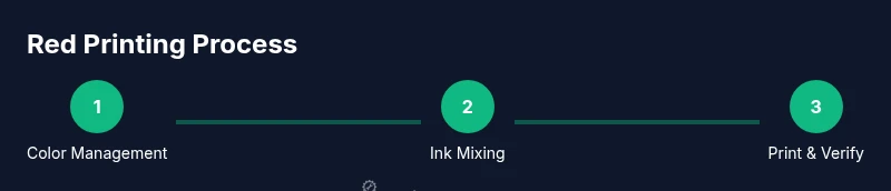
Tools & Materials
- Printer with CMYK inks or toners(Ensure the device supports color management workflows)
- ICC profiles for your printer and paper(Use vendor-provided or vendor-tested profiles)
- Color target charts (IT8 or similar)(For calibration and verification)
- Colorimeter or spectrophotometer (optional but recommended)(Helps quantify color accuracy)
- Quality paper suitable for color work(Match finish (glossy/matte) to your project)
- Printer driver settings or RIP software(Color-managed workflow essential)
- Computer with color-managed software(Use soft-proofing and profile-enabled apps)
Steps
Estimated time: 1-2 hours
- 1
Set up color management
Install and assign the correct ICC profiles for your printer and paper. Open your design software's color management settings and select the appropriate working space and rendering intent. This ensures your digital red maps to the printer's color capabilities.
Tip: Verify that the profile is device-specific rather than universal to avoid unwanted shifts. - 2
Calibrate the monitor
Calibrate the monitor to a known target so screen reds resemble print reds. Use a colorimeter if possible and set a consistent brightness and gamma across devices.
Tip: Do not rely on auto-brightness or ambient light compensation when calibrating. - 3
Prepare the printer and media
Load the paper you’ll be using and check ink/toner levels. Select the correct paper type in the printer driver and apply any media-specific color adjustments recommended by the profile.
Tip: Avoid switching media mid-project to prevent color drift. - 4
Print a target test strip
Print a test strip that varies magenta and yellow to observe red outcomes. Use a small, focused proof to compare against your target color in soft proofing.
Tip: Keep print settings consistent between tests. - 5
Measure and adjust
If you have a spectrophotometer, measure the printed strip and compare to the target. Update CMYK values or choose a different rendering intent based on results.
Tip: Document the adjustments for future sessions. - 6
Print a final proof
Print a final proof using the calibrated workflow and view under the intended lighting. Confirm red matches your design intent before mass printing.
Tip: If exact match is critical, consider a physical proofing service.
People Also Ask
Why does red look different in print than on screen?
Screens use light emission (RGB) while printers use reflected pigments (CMYK). Rendering intents, profiles, and paper choice cause red to shift between devices. Soft proofing helps anticipate these differences.
Red looks different in print because screens emit light while printers reflect it. Color management and paper choice determine how reds shift; soft proofing helps predict the result.
Can every printer reproduce bright red accurately?
Most printers can reproduce vibrant reds, but accuracy varies with ink formulation, paper, and profiles. For critical color, use device-specific ICC profiles and proofing.
Most printers can reproduce bright reds, but accuracy varies by ink and paper. Use device-specific profiles and proofing for critical work.
Does paper color affect red?
Yes. Paper whiteness, brightness, and finish shift the perceived red. Glossy stocks reflect light differently from matte, altering hue and saturation.
Yes. Paper properties change how red appears, especially the finish and whiteness of the stock.
What is an ICC profile and why do I need one for red accuracy?
An ICC profile describes how a device reproduces color and maps colors from your design to the printer. Using profiles tailored to your paper improves red accuracy.
An ICC profile tells the printer how to reproduce colors like red, improving accuracy when paired with the right paper.
Why might red print as orange or pink sometimes?
This often results from inadequate magenta, over-yellow, or poor color management. Ensure correct CMYK values and calibrated profiles for the media.
Red turning orange or pink usually means magenta or pink balance is off; recalibrate profiles and check ink levels.
How long does color calibration take?
Calibration is an iterative process: profile installation, test prints, measurement, and adjustments. It can take 30–120 minutes depending on equipment and desired accuracy.
Calibration is iterative and can take from half an hour to a couple of hours, depending on your setup.
Watch Video
Quick Summary
- Master color management for reliable reds.
- Use magenta + yellow to build red in CMYK.
- Proof with the same paper and lighting as final output.
- Calibrate devices and keep profiles up to date.
- Document settings for repeatable red quality.