Printer Friendly NFL Schedule: A Print-Ready Guide for 2026
Learn how to craft a printer friendly nfl schedule that prints clean, legible, and ink-efficient. This actionable guide covers layout, typography, export formats, and best practices for home offices, classrooms, and fan groups.

A printer friendly nfl schedule is a compact, printable version of the weekly NFL lineup that emphasizes readability and quick scanning. It uses larger fonts, high contrast, and a simple layout to fit on standard paper, while avoiding clutter and unnecessary borders. This approach keeps game data accessible—dates, times, opponents, and networks—without sacrificing legibility or requiring special printers.
What makes a printer friendly nfl schedule work
According to Print Setup Pro, a well-designed printer friendly nfl schedule saves time, reduces waste, and keeps game data accessible across devices. It focuses on legibility, scannability, and minimal ink/space usage while preserving all essential information. In practice, this means choosing an appropriate page layout, strategic typography, and careful color use. A typical approach starts with a clean layout that uses a readable font size, generous margins, and a single column or compact two-column grid to minimize page flips. This structure makes it easy to scan dates, opponents, game times, and broadcasting networks at a glance, whether you're printing one copy for a desk or distributing copies to a classroom. When audience needs vary—home office, school, or fan group—it helps to tailor the level of detail: include dates (not just weeks), show local time vs. UTC, and clarify venues. Finally, run a quick test print on the target stock to confirm margins, line spacing, and contrast before mass printing.
Layout choices that maximize readability
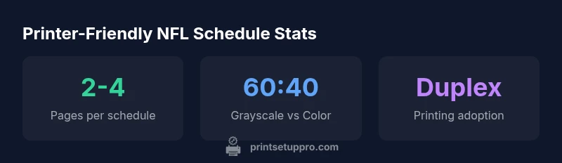
Choosing the right layout is essential for a printer friendly nfl schedule. For many users, a compact two-column layout offers a balance between data density and readability, while a single-column format can work well on small desks or tablets. Key considerations include page size (US Letter or A4), font size (typically 9–12 points for body text, larger for headers), and spacing (margins of 0.5–0.75 inches are common). Breadcrumb-style headings for weeks, bolded team names, and a consistent alignment scheme help readers locate dates, times, and venues quickly. When distributing to a group, consider a version with a thumbnail team logo and a color-coded week indicator to reduce cognitive load. Always test print with the intended stock to verify margins, bleed, and binding edge if applicable.
Typography, color, and contrast guidelines
Emphasizing readability starts with typography. Use sans-serif fonts like Arial, Calibri, or Open Sans for clean, modern look and easy on-screen/off-screen reading. Maintain a maximum of two font families per layout: one for headers and one for body text. Contrast matters: aim for a minimum of 4.5:1 between text and background; use bold weights to differentiate dates or opponents. Color should be reserved for critical cues (e.g., red for a bye week, green for a home game) and kept minimal to avoid excessive ink. Avoid dense color blocks and opt for grayscale where possible to save ink while preserving legibility. Ensure accessibility with high contrast and larger clickable areas for any printed inserts used in shared spaces.
Paper, ink, and printer settings that save resources
Resource-efficient printing begins with stock selection and printer settings. Choose recycled or standard-weight paper when possible and avoid glossy finishes that increase ink usage. Enable duplex printing when content fits, which can halve paper use in multi-week schedules. Set draft or economy mode only if it maintains readability. For ink efficiency, use grayscale printing for most text and reserve color only for highlights. Previews matter: enable print preview to catch orphan lines and widows that waste space. Finally, calibrate your printer’s nozzle tests and alignment to prevent wasted prints due to misaligned margins.
Export formats and file recommendations
Export the final layout as a PDF to ensure consistent formatting across devices and platforms. PDFs preserve fonts, spacing, and margins, reducing the risk of misprints when sharing with teammates or students. If you need an editable version, use an OFA-friendly format such as a lightweight Word document or a constrained Excel layout, but always re-export to PDF before printing. For digital distribution, provide a clean, mobile-friendly HTML version or a compressed image set for quick viewing on phones. Keep an original master file with clear layer labels so you can update weekly data without rebuilding the entire schedule.
Printable layouts: One-page, two-page, and multi-page options
Three common printable formats serve different use cases. A one-page compact schedule is ideal for portable use and quick reference; it compresses week-by-week data into a single glance. A two-page digest spreads data across two sheets, offering more legibility without sacrificing compactness. A three-page expanded schedule provides the most detail, including notes, broadcaster information, and venue context, suitable for classrooms or fan groups that want extra context. When choosing format, consider audience needs, print volume, and distribution method. Save templates for each format to streamline future weeks and avoid reformatting.
Printing workflows for different environments
Home offices, classrooms, and fan groups each have distinct workflows. In a home office, maintain a single-source master file and generate PDFs on demand to minimize wasted prints. In classrooms, print in batches and bind into small booklets for student use, with large headers for easy navigation. For fan groups, offer a sharable digital version alongside a printed version to reduce rush-printing during game weeks. Automate weekly updates where possible, or establish a simple hand-off workflow to a teammate who handles the printing schedule. The goal is to keep the NFL data consistent and accessible while avoiding unnecessary reprints.
Comparison of common printer-friendly NFL schedule formats
| Format | Pages | Best Use |
|---|---|---|
| One-page compact schedule | 1 | Quick glance, portability |
| Two-page digest | 2 | Moderate-detail planning |
| Three-page expanded schedule | 3 | In-depth planning with notes |
People Also Ask
What defines a printer-friendly NFL schedule?
A printer-friendly NFL schedule is a concise, legible printable version of game data optimized for standard paper. It emphasizes clear headings, ample margins, and restrained color usage to ensure readability without wasting ink. It should be easy to print from common devices and accessible to a broad audience.
A printer-friendly NFL schedule is a clear, printable version of game data that’s easy to read on standard paper. It’s designed to print cleanly from everyday devices.
Which layout is best for printing on standard letter paper?
For standard letter paper, a compact two-column layout often provides a good balance between data density and readability. A one-page version can be ideal for quick reference, while a three-page layout is useful for deeper context in classrooms or fan groups.
Two columns usually give you a clean, readable schedule on letter paper, with one-page and three-page variants for different needs.
How can I reduce ink usage while maintaining readability?
Use grayscale printing for body content, reserve color for critical highlights, and employ high-contrast fonts. Turn off unnecessary borders and shading, and prefer larger type for legibility rather than dense grids. Always test print on your stock first.
Print in grayscale, limit color, and test print to keep readability without wasting ink.
Can I reuse templates for multiple seasons?
Yes. Start with a stable master template that holds the overall structure, then update only the team, date, and broadcast data each season. Save each weekly version as a dated copy to avoid overwriting the master file.
Absolutely—use a stable template and update data every season, saving copies for reference.
Is color printing necessary for readability?
Color is helpful for quick cues but not strictly necessary. Use color sparingly to highlight critical data (like home games) and rely on bold text and contrast for general readability. Grayscale prints are often perfectly adequate.
Color helps, but grayscale is usually enough if you use bold headings and strong contrast.
What file format should I export for sharing with teammates?
Export a PDF for reliable printing and distribution. Keep an editable master file in a common format (like a spreadsheet or doc) for future updates, then re-export to PDF for final sharing.
PDFs are best for sharing, and keep a master file for easy updates.
“A well-structured printer-friendly NFL schedule reduces confusion and keeps essential game data accessible at a glance, even when printed in bulk.”
Quick Summary
- Choose a compact format for portability and speed.
- Prioritize legibility with larger fonts and high contrast.
- Print in grayscale (when possible) to save ink without sacrificing clarity.
- Test print on target stock to verify margins and alignment.
- Save the layout as a PDF to preserve formatting across devices.