What to Print Wedding Invitations On: A Practical Guide
Discover the best stock, finishes, and printing methods for wedding invitations. Learn how to choose cardstock, sizes, and finishes to create professional-looking invites at home or with a printer.

To print wedding invitations, start with stock that ink adheres well and feels right for your theme: cotton rag or smooth cover stock in a medium to heavy weight. Choose a matte, satin, or pearl finish, and ensure compatibility with your printer and envelopes. Do a test print first for color and bleed.
What to Print Wedding Invitations On
When you ask what to print wedding invitations on, you’re choosing the base material that defines color accuracy, texture, and readability. According to Print Setup Pro, the right stock balances ink absorption with a surface that layers cleanly with text, graphics, and any decorative foil or embossing. Start with a craft-friendly approach: select a cotton rag or smooth cover stock that feels substantial in hand, and align your choice with your theme, venue, and budget. For home printing, a medium-to-heavy weight stock with a smooth or lightly textured surface provides robust results while reducing show-through on dark inks. Always verify envelope compatibility and run a few test pages to calibrate color, margins, and bleed before committing to a full print run.
Stock Options and Feels
The material you pick communicates your wedding’s tone. Cotton rag stock offers a luxurious, tactile feel and excellent ink uptake, which helps with saturated colors. Smooth cover stocks are versatile, print-friendly, and widely compatible with home printers. Textured options like linen or felt mimic traditional letterpress effects without the cost, while pearlescent or metallic finishes add a hint of glamour for evening weddings. If you’re unsure, request samples from a printer or supplier and compare how each stock responds to your chosen fonts, ink, and any foil accents. Keep in mind that heavier stocks require better feed alignment and may constrain print density on small type.
Finishes and Their Impact on Readability
Finish choices shape readability and mood. Matte finishes reduce glare for easy reading and modern aesthetics, while satin balances vibrancy with smoothness for photos or graphic-heavy designs. Pearl and metallic sheens bring sparkle to formal invitations but can affect color accuracy and legibility in certain ink colors. For text-heavy invites, a matte or satin finish often yields the best legibility. If your design relies on high-contrast typography, test a few color combos on your stock of choice to ensure legibility in various lighting.
Printing Methods: Home vs Professional
Home printing offers flexibility and control, but it demands careful stock selection and printer settings. Inkjet printers are common for DIY invites, while laser printers provide faster runs and crisper text on many stocks. If you plan foil or embossing, you’ll likely rely on a professional service or specialty equipment. Bleed, margins, and color calibration are critical in both scenarios. For DIY, always design with a bleed area and align text away from the trim to prevent misalignment after cutting or finishing. For professional printing, request proofs to verify color consistency and finish appearance before full production.
File Preparation: Bleed, Margins, and Color
Proper file preparation reduces the chance of misprints and uneven edges. Use bleed around all edges — typically at least 1/8 inch — so the ink extends to the edge after trimming. Build margins to keep essential text away from the trim line. Convert fonts to outlines if you’re sending print-ready PDFs, or embed fonts when using editable formats. Color management matters: calibrate your monitor and, if possible, print a color profile test page to check reds, greens, and skin tones. Include crop marks if you’re trimming by hand or with a cutter. Keeping designs clean and aligned minimizes post-print adjustments.
Eco-Friendly and Accessible Options
If sustainability matters, consider recycled or partially recycled stocks with responsibly sourced fiber. Look for sleeves and envelopes made from recycled content to complete an eco-conscious package. Text readability should still guide your choice; rich blacks on recycled stock can appear slightly warmer, so adjust color values if needed. For accessibility, use high-contrast text and simple typefaces to ensure legibility for guests with visual impairments. Choosing an accessible option does not have to compromise elegance—ample warm textures and tasteful color work well with inclusive design decisions.
Testing, Color Calibration, and Consistency
Before printing a full batch, perform a controlled test run on the same stock you’ll use for production. Print on a few sheets, then review color balance, alignment, and edge quality. If you notice color shifts, adjust printer color profiles or convert your file to a standardized color space (like CMYK) to reduce surprises on the final run. Consistency comes from validated settings: keep feed orientation, paper type, and print quality constant across all sheets. Saving a preset in your printer software or design program speeds up future projects and minimizes human error.
Budgeting Your Invites: Time, Materials, and Services
Estimate the costs by accounting for stock, printing time, and finishing options such as scoring, trimming, or envelope addressing. DIY invites reduce per-unit costs but require more time and careful handling. Professional printing adds convenience, proofing, and sometimes custom finishes, which can enhance perceived value. Plan for a small buffer in your timeline to accommodate proofs, dry runs, and potential touch-ups. If you’re coordinating with a venue or photographer, align timelines so your invites arrive well before RSVPs and save-the-date cards.
Tools & Materials
- Printer capable of color printing (home or office)(Ensure it supports the chosen stock weight and has a manual feed option)
- Quality cardstock stock (cotton rag, smooth cover, or textured)(Choose a stock marketed as invitation-weight or cover stock; consider 80–120 gsm equivalents in context)
- Design software or online tool (InDesign, Illustrator, Canva, or equivalent)(Prepare bleed, margins, and crop marks; export as print-ready PDF when possible)
- Envelope stock and compatible envelopes(Match size to your invitation (A6, 5x7, or custom); consider security features if addressing by hand)
- Scoring tool or bone folder(For clean folds and professional appearance on thicker stock)
- Ruler, hobby knife or paper cutter(Precise trimming for even edges; ensure safety when cutting)
- Testimonials or sample swatches(Order or collect small samples to compare texture and color before committing)
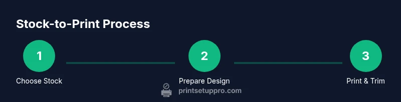
Steps
Estimated time: 1 hour 30 minutes
- 1
Choose the stock and finish
Select a stock with a suitable weight and texture for your theme. Test a sample sheet to assess ink absorption, color fidelity, and readability under your lighting. Make sure the stock is compatible with your printer’s feed mechanism.
Tip: Order small swatches and compare both your screen and print samples before committing. - 2
Prepare the design with bleed
Design with at least 1/8 inch bleed on all sides. Include safe margins so text isn’t trimmed. Convert fonts to outlines or embed them to avoid font substitution issues.
Tip: Use crop marks only if you have precise trimming equipment or a professional cutter. - 3
Set up printer and color profile
Configure your printer for the chosen stock (print quality, paper type, and orientation). Calibrate color using a test page; adjust for dark inks or vibrant tones as needed.
Tip: Print a single test sheet first to verify margins and color before running a full batch. - 4
Run a test print and adjust
Print a small batch on the actual stock and review alignment, edge finishing, and ink density. Tweak settings until the sample looks correct.
Tip: If colors look off, consider converting to CMYK before final printing. - 5
Print final copies
Print the full run in batches to avoid jams. Allow ample drying time before handling to prevent smudges, especially on matte finishes.
Tip: Handle sheets by edges; use a clean workspace to avoid fingerprints. - 6
Trim, finish, and address
Trim invitations to size with a straight edge; apply any finishing touches (folds, scoring). Address envelopes and consider a sample RSVP card for completeness.
Tip: Batch-address or use calligraphy services for a polished look.
People Also Ask
What is the best paper weight for wedding invitations?
Most couples choose a medium to heavy invitation-weight stock for a sturdy, premium feel. The key is balancing weight with printer compatibility and readability.
For the best result, pick a medium to heavy stock that your printer can handle and that feels substantial in your hand.
Can I print invitations at home?
Yes, with the right stock, printer, and color management. Plan for proofs and drying time, especially with darker inks and textured papers.
Absolutely—just be sure you have the stock, a good printer, and time for proofs and drying.
Should I use bleeds and margins?
Yes. Bleed ensures edge-to-edge color after trimming, and margins keep text safe from the cut.
Yes—bleed for edge-to-edge color and margins to protect the text from trimming.
Is glossy paper better for invitations?
Glossy can enhance photos and colors but may glare; matte or satin boosts readability and a modern look.
Glossy looks amazing for photos, but matte is usually easier to read and more versatile.
How do I avoid ink smudges?
Allow ample drying time, use pigment or quick-dry inks, and handle sheets by edges until fully dry.
Let the ink dry fully and use quick-dry inks to reduce smudging.
What stock works well with foil or embossing?
Choose a smooth, light-to-medium weight stock to support foil or embossing without tearing or warping.
A smooth, sturdy stock works best for foil or embossing while maintaining durability.
Watch Video
Quick Summary
- Define stock and finish before designing.
- Bleed and margins prevent trimming issues.
- Test print on actual stock first.
- Match envelopes for a cohesive look.
- Consider eco-friendly options for sustainability.